Almost every company or organisation has a graphic representation which usually will be seen as their logo. Often, it’s not really a logo but just the company name in a specific font and sometimes some graphic decoration. To help you understand what is needed for your organisation let me explain some basics.
Symbol vs Logotype

It takes time for a Symbol to be known. Usually it doesn’t even say anything about your business or organisation, and therefore a logotype is often chosen because it can have the name or describes what you do.
If we look at the brand Signdev, no symbol was needed, and we used the orange and black to split the words in the two things they do exactly: Sign Development.
![]()
With Studio Koch, we have a much broader audience and it was important to be able to use a symbol as a “mark” that we can use discreetly on websites that we made or on social media. For any new symbol it is important to be combined with text (often the brand name), in order to create a clear reference. We use our brand name “studiokoch”, but also “think inspire connect” which is our tagline, and for the website it even functions as the navigation menu.
Applications
Often forgotten is the importance of the application, on which you will be using it. Is it going to be Business cards, Envelopes, Letters, Brochures, and Signs around your office? Or would it be Promo-wear, Flags, Merchandise? And, most important, how does it look when it is presented online, for example on a Website, E-mail and of course on social media?
Today, the size of the available space you have is very small. Just think about social media where you need to “squeeze” your logo into a little profile icon. Also websites are often viewed on a phone which limits your possibilities due to a small screen. So, the importance of using a symbol is bigger than ever before.
Test it yourself. If you have an existing logo, what do you see when you make it very small, reduce colour, or remove the text? It’s also good to ask people who don’t know you or your organisation well. What is their first association with your logo or icon?
Colour
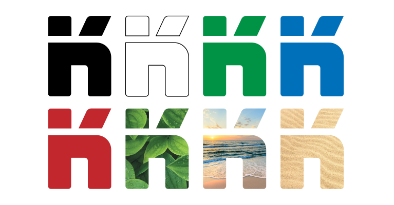
Colour does not necessarily need to be a fixed element. It is essential to choose your brand colours, but sometimes you simply cannot use colour. For instance, in a local newspaper which is not printed in colour or at the local tennis or golf club where they often only use only green, black and white. Think about if your logo can still stand in these cases.
Maybe the below example is an exaggeration, but you see that recognition stays the same whatever colour or even photographic backing is used.
Associations & Brand name
A powerful tool for any logo can be associations. But, it can also be a trap which will limit your brand in the future. Strong associations help with the recognition of a brand, but it should be used with care. If I have to be honest, better a limited association rather than having a fixed or even a negative association.
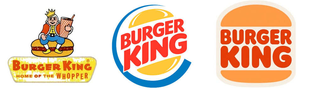
A simple example is the Burger King logo. See above their logos from 1957, 1999 and 2021. Of course with this brand name and logo you can assume they are focussed on only burgers, which they obviously want.
But what about your brand? Do you want such a strong association? Maybe a more neutral or abstract solution fits better with your brand?